Designing an eCommerce Marketplace That Makes Energy Savings Easy
Role: UX UI Designer
Responsibilities: UX Design, UI Design, Information Architecture, Responsive Design, Wireframing, Prototyping, Stakeholder Collaboration, Developer Handoff
Tools: Figma, Illustrator, Photoshop, Google Gemini
Overview
SRP (Salt River Project) wanted to expand its energy efficiency initiatives by launching an online marketplace where customers could purchase qualifying energy-efficient products while taking advantage of rebates and utility programs. The overall goal was to create an experience that educated customers about available incentives without overwhelming the shopping journey.
As a Designer, I collaborated with stakeholders, marketing, and developers to design a marketplace that balanced business goals and customer education, and a smooth ecommerce experience.
Challenge
Unlike a traditional online retailer, SRP's marketplace needed to do more than sell products. Customers also needed to understand utility rebates, promotional pricing, and participation requirements for programs like Bring Your Own Thermostat (BYOT).
The challenge was finding the right balance between educating users and maintaining a streamlined shopping experience. Too much information could distract customers from purchasing, while too little could create confusion about available savings.
Key Insights
The Marketplace was Designed to:
Create a simple and intuitive shopping experience.
Increase adoption of energy-efficient products.
Clearly communicate rebates and utility programs.
Reduce confusion around promotional pricing.
Maintain trust through transparent pricing.
Support customers across desktop and mobile devices.
Design Roles Included:
Designing responsive page layouts
Creating wireframes and high-fidelity mockups
Improving product pages
Designing pricing and checkout experiences
Simplifying complex information
Collaborating with developers during implementation
Design Challenge 1 (Breakdown)
Making Program Information Easy to Understand
One of SRP's key initiatives was encouraging participation in the Bring Your Own Thermostat (BYOT) program.
The client wanted detailed program information displayed directly on thermostat product pages to educate customers before purchasing.
The Problem
While the information was valuable, displaying the full program description on the product page could cause users to:
Skip over the content
Feel overwhelmed
Lose focus on purchasing the product
The Solution
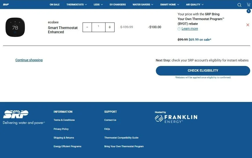
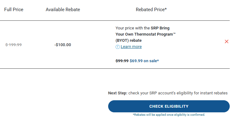
To make pricing easier to understand, I designed a checkout experience that separated each component of the purchase into clear pricing stages.
Original Price: The standard retail price
Available Rebate: The BYOT incentive
Rebated Price: The price after the rebate was applied
To further clarify the final savings:
The rebate-adjusted price remained visible.
That price was crossed out when the product was also on sale.
A lower "On Sale" price was displayed beside it.
Design Challenge 2 (Breakdown)
Communicating Multiple Discounts Clearly
One of the most unique challenges involved pricing.
Customers could purchase a thermostat that was:
Already on sale
Eligible for a BYOT rebate
Receiving both discounts simultaneously
The Problem
Customers might wonder:
Which discount was being applied?
Did the rebate replace the sale?
Was the rebate already included?
Was additional enrollment required?
The Solution
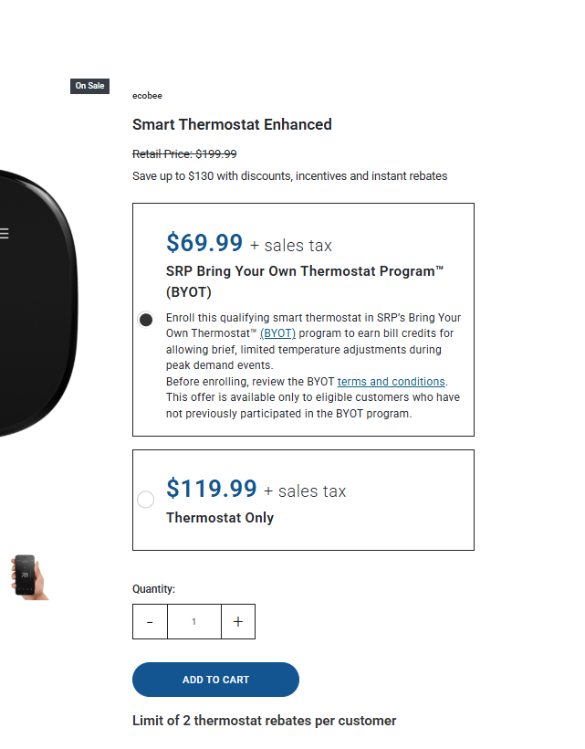
To reduce visual clutter, I replaced the lengthy BYOT program description with a brief summary and a "Learn More" link. This allowed customers to quickly understand the program while providing easy access to additional details.
To improve pricing clarity, I visually separated the retail price from the rebated price. A supporting message, "Save up to $130 with discounts, incentives and instant rebates," helped communicate that customers could combine rebates with promotional sales.
Impact
The final marketplace provided SRP customers with an intuitive shopping experience that made purchasing energy-efficient products straightforward while increasing awareness of available utility programs and rebates.
Key Takeaway
This project reinforced how thoughtful UX decisions can improve customer confidence by simplifying content, clarifying pricing, and presenting complex information in a more intuitive way.
Reflection
User behavior data revealed where users were already finding value and where the experience could better support their needs. Rather than making only visual improvements, every design iteration was informed by measurable user behavior and focused on creating a more intuitive customer journey.
If I were continuing this project today, I would validate these enhancements through A/B testing and new usability studies to measure improvements in product discovery, engagement with cross-promotional content, navigation, and the overall customer journey.
SRP Product Pricing Section
SRP Checkout Page
SRP Full Checkout Page Preview